
Friday, August 31, 2012
Thursday, August 30, 2012

Monday, August 27, 2012

Introduction:
This
document is created to show our logos, colors,
bad use of logos, cards, letterhead, and envelopes.
Our logos are well thought out and deliver
an appealing, tough looking, message, that we
make the coolest custom hot rods.
Typography:
Symbolic Rep uses Arial font size 15 for text and
Ariel size 20 for subheadings, we also italicize the
subheadings. For headings Symbolic Rep uses Kozuka
Mincho Pro H size 26.
Colors:
Symbolic Rep's official colors are symbolic red, white, grey, and black.
Symbolic Red
R: 255
G: 24
B: 7
Logos:
Constant
use of our logo is our way of getting our
name,our brand, and our work out into the world. We use two primary logos figure one is our primary logo and can have a grey, white, or
red background. Figure two is
another logo that is commonly used on some custom hot rods that have a
different style and go better
with second logo. Figure two can also have
a white or gray background

Figure 1 Figure 2
Bad use of logos:
Here
are some examples of incorrect logos. Also any
other colors besides symbolic red, white, black, or grey are bad usage of our logos.


Business Card,
Letterhead, Envelope:


Find
more information at SymbolicRep.com
Conclusion:
Now you know about
our identity standards and our logos. You are able to distinguish between
acceptable logos and unacceptable logos.
Tuesday, August 21, 2012

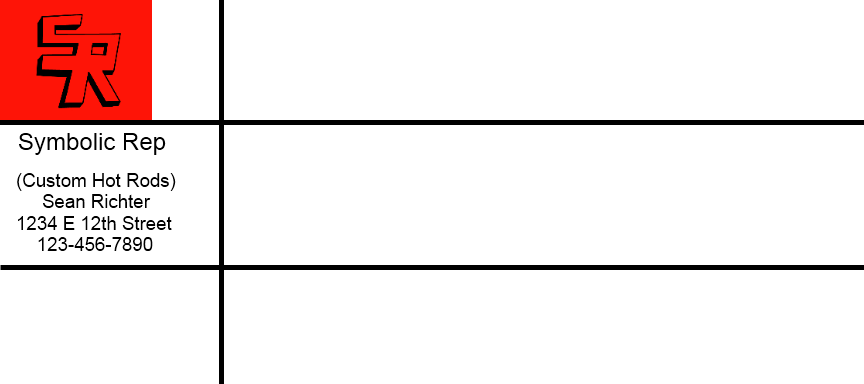
This is my buisinss card. I think that it looks pretty cool. First, I uploaded the logo. Then, I made up a name for my company. Then, I made up a phone and an address.

This is my letterhead paper for my company "Symbolic Rep." It looks pretty professional. First I uploaded my logo. Then I typed my name, my company, my address and my phone number.

This is my envelope. It looks good but you can not see the outline of it because it is white on white. It looks professional and original. I like how it is set up.

Thursday, August 16, 2012
What is graphic design?
Graphic design is importaint. If you are going to give a visual presentation, you need to use graphic design. Graphic designers usuallly design things for other people. They focus on visual communication and presentation. Graphic design is in everyday life. It is on billbords, posters, shirts and many other things.
Graphic design is importaint. If you are going to give a visual presentation, you need to use graphic design. Graphic designers usuallly design things for other people. They focus on visual communication and presentation. Graphic design is in everyday life. It is on billbords, posters, shirts and many other things.
Subscribe to:
Posts (Atom)